
Today we are proud to release the newest addition to the Action Component Suite for the Xamarin platform and Visual Studio, Action Slider. Action Slider is a custom slider control designed to operate like the brightness and contrast sliders built into the iPhone Control Center. The FillPercent property gets or sets the percentage that the slider is filled (from 0% to 100%). If the user taps or drags in the control (from top to bottom) the FillPercent will be adjusted accordingly and the ValueChanged, Touched, Moved and/or Released events will be raised.
Action Slider contains properties to customize its appearance including the border, body and fill colors. Additionally, an optional icon can be displayed at the bottom of the control. In many cases the same code used to display an Action Slider on one platform can be used virtually unchanged on another which not only saves time, but improves code maintainability.
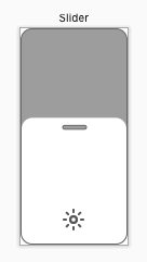
Size and Placement
The Action Slider is designed to be oriented vertically (taller rather than wider), with the 0% position at the bottom of the control and the 100% at the top:
Appearance
Action Slider was designed to look and function the same across platforms, however you have full control over its look and feel. Action Slider is fully customizable with user definable appearances for every element of its UI. You can make adjust the following properties to control the appearance:
BorderColor– Defines the frame that appears on the outer edge of the control and the border around theDragThumbat the top of the control.BodyColor– Defines the background fill color of the control and the fill color of theDragThumb.FillColor– Defines the color of the percent filled area.Icon– Defines an optional icon that will be displayed at the bottom of the control.
Any change to the above properties will cause the Action Slider to instantly redraw and reflect the change.
Features
Action Slider includes a fully documented API with comments for every feature. The ActionAlert‘s user interface is drawn with vectors and is fully resolution independent. Additionally, an Action Slider can be added to an app’s .storyboard (iOS) or .axml(Android) file at design time or added to the UI programmatically at runtime.
Use the FillPercent property to get or set the amount that the control is filled from 0% to 100%. As the percent is increased, the control will fill from bottom to top.
Responding to User Interaction
The user can interact with an Action Slider in one of two ways:
- Tapping – If the user quickly taps and releases a location inside of the control, the
FillPercentwill instantly be set to the appropriate value corresponding to the location of the tap. - Dragging – If the user taps and drags up or down inside of the control, the
FillPercentwill interactively be adjusted.
Based on the type of interaction, the ValueChanged, Touched, Moved and/or Released events will be raised in response.
Trial Version
Examples of implementing an Action Slider are available for both iOS and Android from our GitHub site. The Trial version of Action Slider is fully functional but includes a Toast style popup. The fully licensed version removes this popup.